This narrative is clearly much different in terms of Uprising by Muse which features a miniature city being destroyed by demonic teddy bears, however links can still be made to others, even if the narrative changes. Namely the music video for Lyla by Oasis has links towards the idea of rebellion since this video features a young woman who happens to rebel against someone who appears to be her violent boyfriend. Along with the Uprising video there is a clear theme of rebellion within these videos, moreover the video for the song Numb by Linkin Park has clear links to rebellion as this features a girl who is visibly isolated and lonely who starts to rebel against her parents and everyone around her. Therefore the actual content of the narrative changes drastically in accordance to each video, however it was clear that the themes of drugs, sex, alcohol and rebellion are all substantially prevalent in each narrative to some extent. Therefore we could see that we needed to implement these themes within our narrative in order to conform to the typical conventions of the genre. In order to do the video we first needed to get permission for the song, this meant that we searched through YouTube as much as we could to find a cover of a song that we could get permission too that would help us link to the genre. After searching we eventually found a singer called TWEEDA on YouTube who had a cover of the song All The Small Things on one of his videos, I subsequently asked him for permission to use the song and he thankfully gave us permission to do it.


Here are a few shots from the video in which we clearly showed that we conformed to the conventions of these videos by highlighting both drugs and alcohol into the video and explicitly show them being taken by the characters within the video. This helps us conform because the videos generally feature a clear shot which has alcohol or drugs involved to some extent.


The fact that these conventions were all conformed to within these videos helped signify to us that this was a convention of alternative rock videos that we had to include. Specific shots of the singer seemed to orient around a side angled close up shot whilst they were singing the lyrics to the song. This can be seen in videos such as Lyla by Oasis, Numb by Linkin Park and Crash by Fit For Rivals. Therefore we tried to replicate this as much as we can. In each of these images the top images is taken from an actual music video that we used in our research and the bottom images are then taken from our music video. As you can see there are multiple shots and mise en scene that we had to conform to in order to reflect a typical video of the genre.


More influences for the album cover included the front covers for the albums such as The Resistance by Muse and Music For The People by The Enemy. Both of these had a spherical shape made in the centre of the album which helped us link towards the conventions of the genre, a black background as well also presents this which helped give our album the exact same 'look' of some of the other album covers created for the genre. By giving the band it's own identity it allows the fans of the band to feel more like a cult because they will understand that the album will have links towards the band however an everyday member of he public will not, therefore they can link more towards their fans and relate more to them rather than by a band that is more commercialized. In order for the general population to understand what the band is called we made a spine that would go on the side of the packaging, this spine has the exact same font used on the posters for the band and is the same colour and uses the same image taken from the front cover to maintain consistency.


The swirl image was made via Photoshop, this software allowed the swirl to be used in order to reflect the conventions of the genre. This swirl was then used within almost every area of the subsequent print products. This was in order to maintain consistency and help present a clear image of identity to the customer because they will recognize the swirl image and be able to relate it to Tweeda. This same image was then used on the back cover to maintain consistency however the colours were subverted in order to make it different. As with the album front cover, we also identified various conventions that link towards the back of the album cover, namely the fact that there is generally a direct link towards the front cover, very often this will involve having the same style and artistic ‘look’ of the front cover. Track listings are a more obvious inclusion since this is typically the main part to include within the back cover. Another aspect that we needed to include was various logos that help indicate all the legal aspects we needed to implement such as copyright laws, record labels, etc.
After consolidating this research we then implemented the various necessities that were found. This meant that we used the same image which was used on the front cover but subverted the colour in order to make the image different, as said before. This allowed us to link towards the front cover and thereby match the conventions of typical album covers. We also included a track listing of each song and the various logos we were legally obligated to include, namely the record label, the logo for compact disc and all the copyright infringement laws. We also chose to implement a QR logo. We chose this because we felt that it would be very ‘hip’ and modern to utilize new technology, this meant that we would be able to appeal to an audience based around teenagers. If the QR logo is scanned it will show the words “TWEEDA SAY BUY THIS ALBUM” on the user’s phone.


These images show the album covers for the Oasis album Definitely Maybe, the top image shows the back cover whilst the bottom shows the front. Clearly there is a link between the two as the image taken is in the exact same environment and has the exact same 'look' aesthetically to the front cover. We tried to replicate this as much as we could, we could see that this was a clear convention because of albums like this as well as other albums such as The Killers album Day and Age.


For our digi pack we decided to utilize the same spherical image that was used on the front and back cover, each image helps represent an individual song. We altered the colour each time of the spherical shape in order to reflect the moods or themes of each song. Moreover an image is added in the centre which helps reflect the tone of the song. At the bottom of the image we placed the name of the song along with a lyric that would be used within the song. These two songs are All The Small Things and A Tsunami Is For Life. We chose to implement a bottle of alcohol for All The Small Things because this links directly towards the video and the tone that was set within our version with clear themes of drinking and typical teenage antics. We then used a variety of very bright, vibrant colours, this helps present a slightly more light hearted. “A Tsunami is for Life” uses the same spherical shape to maintain consistency. The use of blue and white is done in order to reflect the colours of a wave. The use of a wave in the image is an obvious choice since it reflects the song title and the fact that it is a tsunami.
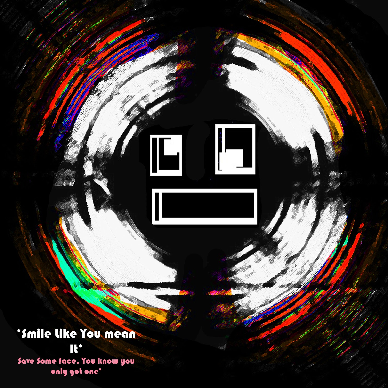
The next 2 songs that are taken from the digi pack are “Antagonism doesn’t give a s**t” and a cover of The Killers “Smile Like You Mean It”. With “Antagonism” we decided to use the colours of red in order to emphasize a sense of passion and anger which are generally associated with antagonism. We then used a typical anarchy symbol in the middle of the image to reflect a more antagonistic approach which can reflect typical teenage antics. Moreover the use of swearing in the title helps amplify more aggressive themes towards the song which is then reflected within the red and orange colours as this replicates the colours of fire and therefore anger. “Smile Like you Mean It” is more sarcastic and less serious, to emphasize a sarcastic approach to the song the ‘smile’ is more distorted to reflect a forced smile image, this sarcastic approach is a bit less typical of the genre indicating how certain aspects of alternative rock we have subverted. The colours are also very distorted, there is no clear colour pattern on the outside of the sphere which helps reflect a more distorted, confused feel towards it. Then the use of white helps reflect typical colour imagery of a smile. This same scheme carries on throughout the other songs in order to reflect their themes which help reflect the album as a whole.


Here are the two posters which we created for our project. We developed these after looking through various posters from other bands including Stereophonics, Oasis and Linkin Park. These all indicated that we should create a poster which was very indie in the sense that it did not need to feature any reviews or even many links to social media, instead it just needed to feature the artists name and the release date of the album. This would thereby appeal to members of the public who are already fans of the band and thus do not need to have any information regarding who the band is, they only need the information that is necessary for them to understand that the poster is for Tweeda and the release date for the album. In contrast the the other poster we created is for the general members of the public, this would subsequently include links to various social medias as well as reviews from multiple magazines, this would help convince the general everyday customer that the band is worth listening to.


http://www.youtube.com/watch?feature=player_embedded&v=bPSGMevQ1X0 - Here is a link to an interview in which we as a group answer this question.
2. How effective is the combination of your main product and ancillary texts?
Within our project we found that it was very notable that the majority of our research indicated that the link between the music video and the subsequent album cover and digi pack was very minimal. Very often the music videos would have little to no correlation with the music videos that come with the album. This meant that we felt that we did not need to provide a direct link towards the main product and the texts. The only link that could be identified, although still not direct, is that they both still follow the themes and conventions of the genre, the fact that the idea of rebellion, sex, drugs and alcohol is all still prevalent within the majority of the products indicate a link which is much more vague and hard to identify however it is nevertheless present. This thereby makes everything much more subtle and is therefore much harder to see, the video features numerous moments in which drugs, alcohol and rebellion are explicitly shown.
Then in the digi pack it becomes clear that these are shown again and are again very explicitly shown, instead of having a shot of an actual can of alcohol or pill, this has changed to an animation which shows a needle and a bottle of alcohol. This means that the link is still there with the fact that the themes are still reflected however a direct link as in an established shot or using still shots from the video and in cooperating this into the print products was not used because we felt as though it would not help us reflect the typical conventions of the genre. In order to do this then the best way was clearly for us to just try and reflect as much as we can the typical conventions of the genre and after consolidating all our research it became clear that the best way to do this was just to make each product it's own stand alone piece, the print products have numerous links towards the spherical shape however this maintains consistency and links towards the conventions of the genre, but a direct link between the print products and the video was not typical at all, therefore in order to link to this we decided that we should still present the same themes within both because this helps us link to the genre as a whole, however a direct link between the print products and the video was not made because we felt as though this was make it so that we no longer were conforming to the typical conventions of the genre.
http://www.youtube.com/watch?v=nNnRl71VH1k - Here is a link towards an interview we made as a group which may answer the question more clearly with perspectives from each member.
3. What have you learned from your audience feedback?
To learn from our audience feedback we decided to conduct an interview with various people who were linked towards the audience of our genre, this meant that they were all teenagers and thereby conformed to the target audience that this band would be targeting if they were real. Generally speaking, the people who did see both the music video and the print products were very impressed and thought that they were very effective and conformed to the genre effectively. Many stated that it was clear that they provided links towards videos that have been made by real bands for the genre, namely two of the interviewees reflected that the 'spinning shot' when the characters had taken drugs was very effective in the sense that it clearly showed that they were on drugs and reflected the emotions and the feelings of the characters very well. This shows that the audience feedback was generally very positive, however there were some negative criticisms, one interviewee in particular indicated that he didn't like the drinking scene and felt that it was too commercial, after speaking with him after the interview I also gathered information from him that indicated that he felt that the video was too unrealistic and that it was not fully aesthetically pleasing, later referring to the video as "cheap".
Moreover the sex scene which was only implied was only picked up by one out of five people which shows that perhaps the stuff we showed in the music video could have been more explicit in order to show the sex scene more clearly. For the print products it was also very clear that these were also very well received and that the colours were very well received as well because many of the interviewees commented on how much it reflected the mood of what was shown. Overall this shows that the entire project as a whole was very positively received and that the only real criticisms were oriented around the music video, these critics only really criticized very minor aspects like the fact that the alcohol was seen as commercial and that the sex scene was not completely clear. Therefore I feel as though if we were to change any of these aspects then the only things that should have been changed for the future should orient around the music video and that these should focus on trying to make the sex scene more clear as opposed to just throwing clothes against the wall and perhaps the locations could have been chosen better, I feel as though the live performance location helps link to the genre however the location isn't very grand or rich in detail and is more very simple, this does mean that I can see the argument one of the interviewees makes when he refers to it as "cheap" however I feel that this is more nitpicking because generally the audience feedback indicated that the products and the video were both very effective and helped us link to the genre very well.
http://www.youtube.com/watch?v=BneBjrgoyfs - Interviews
http://www.youtube.com/watch?v=AsI3H21Qso4 - An interview with us in which we discuss the question as a group.
4. How did you use media technologies in the construction and research, planning and evaluation stages?
Within our project it was definitely very important for us to use as many media technologies as we possibly could in order to create a music video and subsequent printing products as effectively as possible. Within my research I used the website YouTube in order to research through numerous videos such as Numb by Linkin Park, Uprising by Muse, Damages by Fit For Rivals and Lyla by Oasis. By researching these I was able to fully understand precisely which shots, mise en scene and general themes I'd need to make sure we implemented into our video. Moreover I was able to use Facebook during the production process to communicate with the fellow members in my group which meant that we were able to organize ourselves on filming days. This website was also used in order to get in contact with the YouTuber Tweeda who had the cover of the song we wanted to use. Thereby it was much easier for us to get permission for the song we wanted to use and were able to start the production process much quicker than we would have otherwise.
During the production process Katie managed to purchase a new camera. This camera had the capability of recording at full HD 1080p. This means that every single shot we used was able to be incredibly clean and crisp which subsequently increased the complete quality of the video as it made every shot of the video be incredibly clear and managed to capture an incredible amount of detail. We were also able to create numerous effects using the camera, namely the spinning shot when the characters had taken drugs was able to utilize the manual exposure tool in which the depth of the shot is very clear and the focus of the audience can be focused on the character in the middle of the shot which means that the quality of the shot was very effective and thereby allowed us to have a larger impact on the audience. Moreover other effects were used such as being able to blur out the lights when shooting the live performance, this was used when the camera was in a close up shot of me when I was singing, as I got to a specific point in the song the camera started to focus in on me and blur out the background of the live performance so that the shot added a more artistic affect onto the audience. For the music video overall we were able to use various technologies that were available within the camera, we were also able to use various technologies when editing. For our music video we used Adobe Premier Elements 10. The main advantage we had with doing this was because it was downloaded onto Katie's laptop which allowed us to be able to work on the video after school, therefore we had more time to work on various aspects of the video in order to help us create an effective video that conformed to the genre. A more technical advantage was that the software allowed the footage to be rendered very quickly which meant that we were able to work on the video more thoroughly. I have also been informed of the difficulty Katie had specifically in trying to synchronize the music with my singing which was also a crucial part of the editing process in which the footage would have had to have directly matched the audio track of our song cover on the editing timeline. We also used various colouring effects in order to try and play with the effectiveness of the video towards the audience, some of the results are shown below, I have commented on each of these and more throughout various previous blog posts.


The software used to create the print products was Adobe Photoshop CS3 which helped us create the posters, album back cover and front cover and the entire digi pack. These were created mainly with me and Sean working together, Sean is more technological sophisticated in regards to using the software however I collaborated frequently in the lessons by instructing him as he went through creating the images step by step while Katie was absent during many of the lessons. We were able to use the software by creating a swirl and then colouring it using various colours to reflect moods of each song. For the evaluation not much media technology was used specifically however Katie's camera was used in order to film the interviews and then the same software, Adobe Elements 10 was used to edit the interviews with our music video. These interviews thereby helped us gain a better understanding of what we have created and how successful we were at doing this.
http://www.youtube.com/watch?v=p1_Q1GeNVcE - Link to our interview in which we all talk about how we used these technologies to create our project.


